
Institute For Essential Care
Brand Development
The Institute for Essential Care (IFEC) is a counselling and mental wellness centre based in the Cayman Islands, offering a safe, compassionate space for individuals and families seeking emotional healing and psychological support.
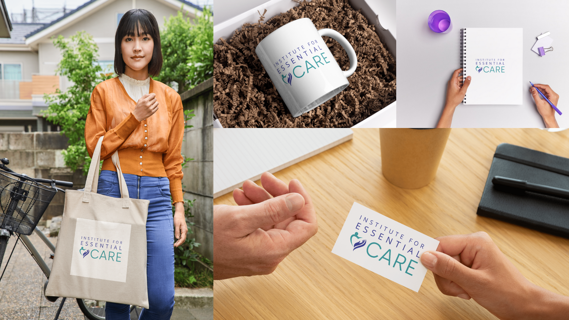
My goal in developing this brand identity was to create a design that felt deeply human yet professionally grounded—a reflection of care you can trust.
The resulting visual system combines a symbolic heart-and-hand logo with a serene, restorative colour palette inspired by healing and the natural warmth of the Cayman Islands. The brand embodies empathy, stability, and hope, translating the essence of care into a cohesive and calming visual experience.
Year
2022-2023
Client
Dr. Shian O’Connor - Founder & Clinical Psychologist, Institute for Essential Care
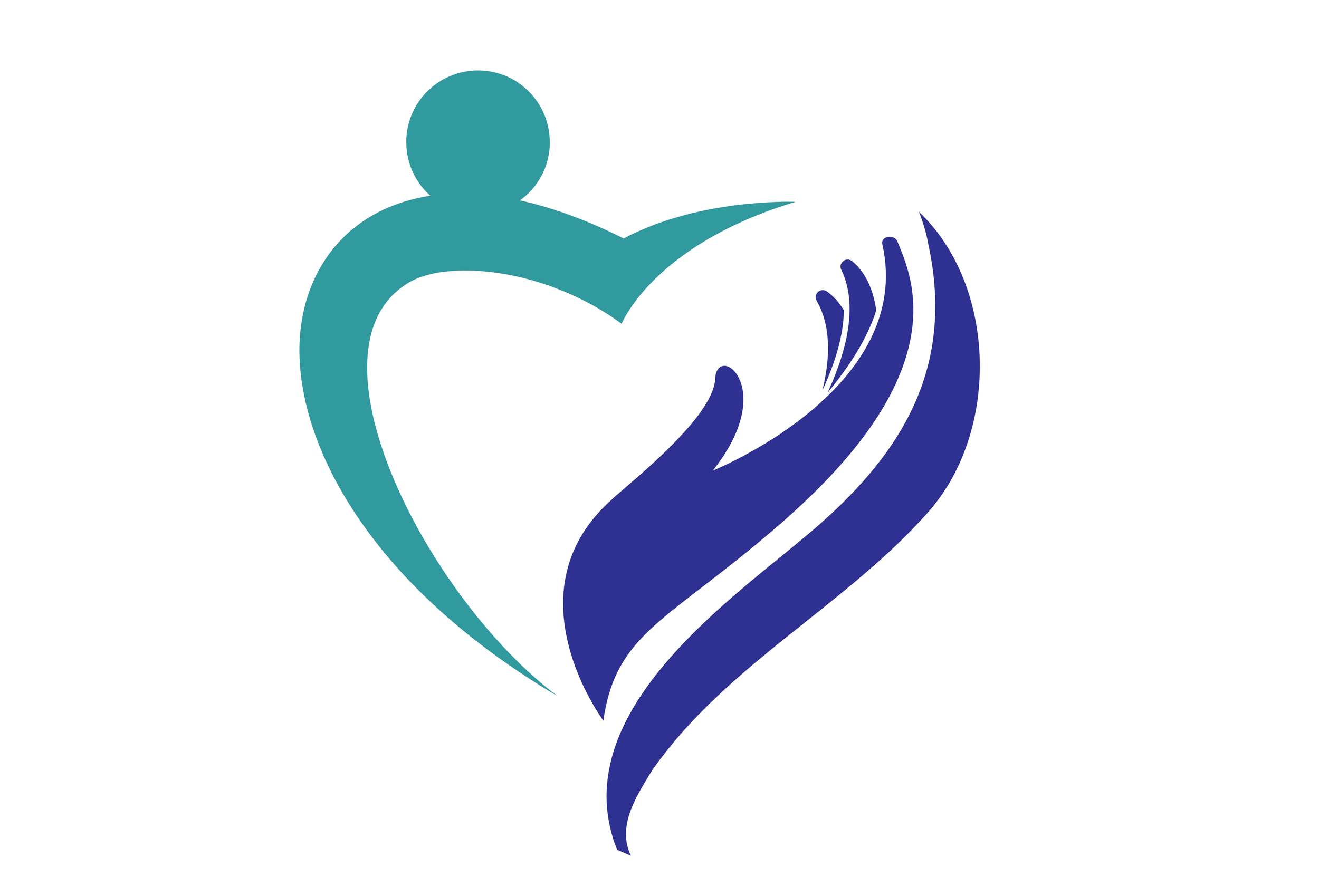
The Icon
At the heart of the identity is a symbol of empathy and support. The icon merges a heart shape with a human figure embraced by an open hand—representing connection, safety, and trust.
The figure symbolises the individual—the person at the centre of care.
The hand represents support, compassion, and guidance.
Together, they form a heart, the universal symbol of care and compassion. The logo’s soft, curved lines evoke comfort and safety, while its open form suggests healing, growth and renewal.
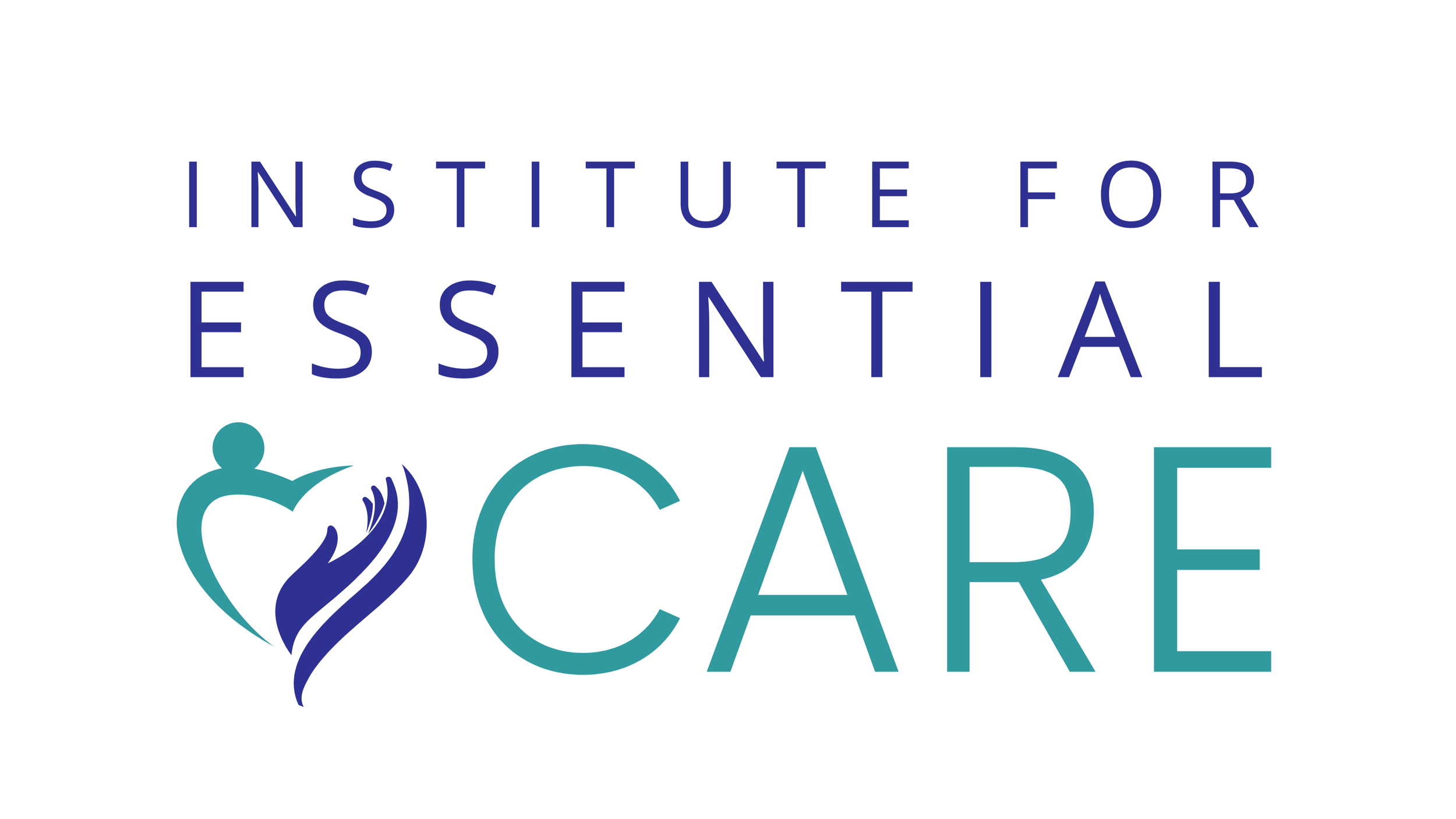
The Wordmark
The typography blends Cerebri Sans and Open Sans to strike a balance between professionalism and approachability.
Cerebri Sans brings structure, confidence, and clarity.
Open Sans adds softness and accessibility.
The result is a clean, contemporary wordmark that feels both steady and welcoming—an echo of the Institute’s mission to bring structure and reassurance to those navigating uncertainty.

Brand Colours
Colour psychology was central to the design approach. The palette had to communicate trust, serenity and warmth, while also reflecting the natural vibrancy of the Cayman Islands.
Primary Palette
Deep Indigo (#2E3192) — Represents wisdom, calm and confidence, grounding the brand in trust and professionalism.
Teal (#319A9F) — The brand’s emotional core, symbolising healing, clarity and balance, bridging blue’s serenity with green’s renewal.
Secondary Palette
Cayman Green (#7BCF5D) — A nod to the island’s lush, restorative landscapes. It conveys growth, vitality and renewal.
Golden Sun (#D283DD) — Inspired by the warmth of the Caribbean light, symbolising hope, positivity and optimism.
Together, these colours create harmony between clinical calm and island warmth, grounding the Institute in its Caribbean roots while maintaining universal appeal.


Reflection
My goal was to capture what care feels like: safe, steady and seen. I wanted the brand to be instantly reassuring—something that radiates calm professionalism without losing its human touch. The interplay of teal and indigo reflects healing and trust, while the accents of Cayman green and gold honour the environment and warmth that define the Institute’s island roots.
This identity tells a story of compassion through simplicity—proof that sometimes, essential care begins with feeling understood.
I sought Ariel's branding services when I was starting my mental health business and the quality was just out of this world. Very creative, very professional - 100% satisfied and I would recommend Ariel to anyone who wants to promote their business.
— Dr. Shian O’Connor - Founder & Clinical Psychologist, Institute for Essential Care